So your print jobs get delivered from the press, colours look different, white lines by the edges and you are totally upset with the printing press… Let me ask, did you prepare the artwork or design for print? A lot of us (graphic designers) tend to ignore the responsibility of this important process, you may have created a fantastic design but if not prepared properly for print, it wouldn’t look exactly fantastic.
If you haven’t prepared a design for press before, here’s a quick guide from my experience in the print media industry. I’ve made quite a few errors – from not sending the right artwork size, wrong colours, displaced pages etc, but I’m better now *smiling*.
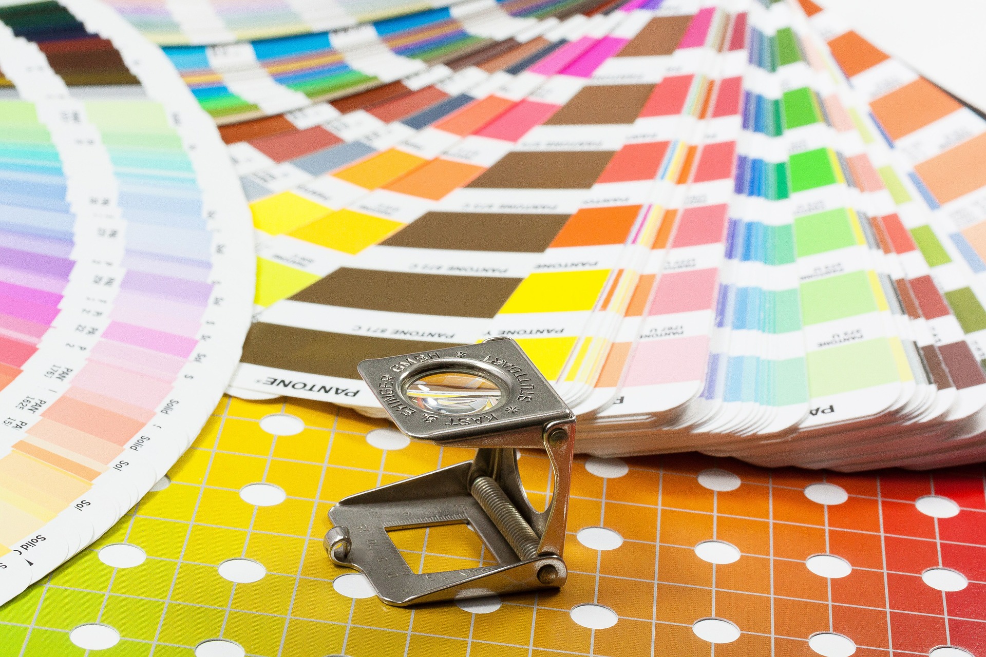
First let’s learn a few terms used in the printing industry:
Artwork: The original design which includes photos, graphic elements and text
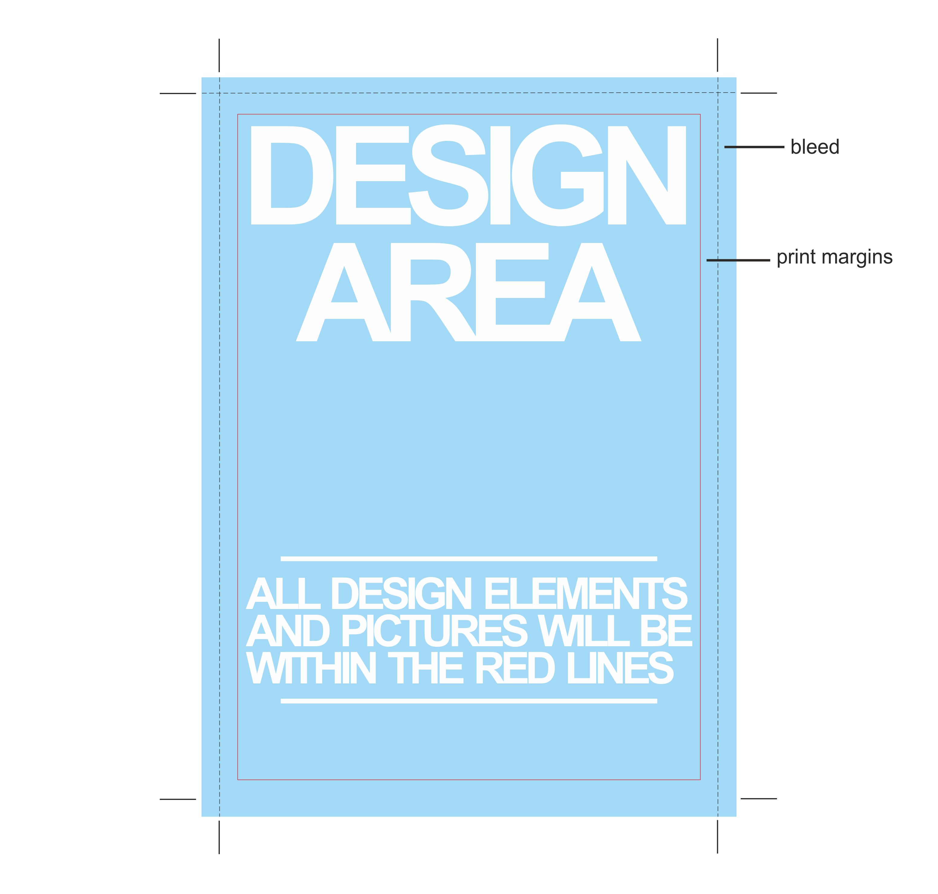
Bleed: this is when your artwork extends out of the print area, this is created so that when the printed artwork is trimmed there are no white edges.
DPI: This means ‘dots per inch’. It’s always better to have a high DPI.
CMYK: These are the colours used for four colour processing: Cyan, Magenta, Yellow and Black. The other is RGB: Red, Green and Blue – the colours used in RGB are not achievable in CMYK so it’s best to use CMYK while creating designs for print.
Large Format: This describes printing on large sized material like banners, billboards etc.
Perfect Binding: A type of binding that combines the cover and the inside pages on the spine with glue.
Separations – During the four colour process printing, there is a continuous tone image that is separated into four different colours – CMYK, enabling it to be printed.
When I begin my design on screen, I create guide lines for the bleed area and the print area, see image below. It’s important not to have the content of the artwork too close to the edge just in case it gets cut off at the press.
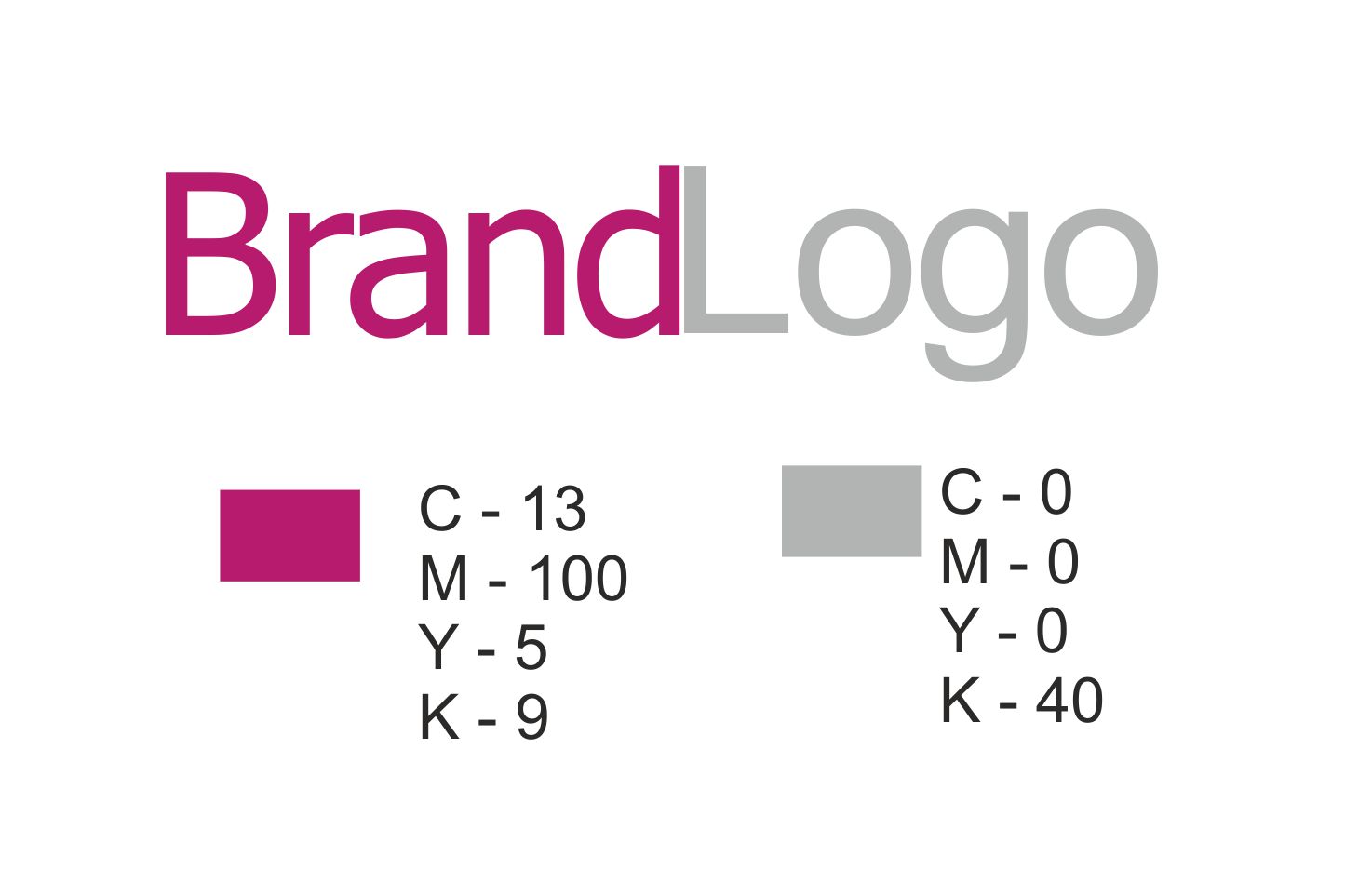
Work with CMYK. Do I need to explain… this is the process used in the printing press (please refer to your printer as some may vary), so to avoid having the wrong colour on the printed artwork, send your artwork in CMYK. Also if you have brand logos in your design, let the printing press have the CMYK colour code to retain consistency of the brand/logo.
Lastly, save your artwork in various file formats, I usually save/export to EPS, Adobe PDF or CorelDraw, but every printer is different so talk to you printer and get requirements before you send the artwork to press, communication is key. Proof read the artwork as well – no typos, use fonts and font size that will not be lost when the design is printed, remember you are creating the design for print and not electronic/digital. Hope these few tips help you prepare better for your next print.
References
Creative Bloq http://www.creativebloq.com/print-design/terms-111142
Fuel Your Creativity http://www.fuelyourcreativity.com/how-to-prepare-a-business-card-for-print-in-illustrator/
Photoshop Café http://photoshopcafe.com/tutorials/printing/printing.htm
Neneh Makun is a graphic artist who designs simple user interfaces. She works in all stages of brand development such as identity design, corporate communication, website design, eCommerce development and print media.
Website – http://mydesigns4u.com/
Blog – http://www.agraphicdesignblog.com/
Facebook – https://www.facebook.com/pages/Mydesigns4u/1406735086287441
Twitter – https://twitter.com/nenehs_tweets